Urban Ellegance
C Flux Logo Design
” Urban ELLEGANCE Handcrafted Jewelry is the tie that binds the “street savvy woman”, navigating her way through the concrete jungle,to the “boardroom beauty”,that allows her accessories to voice her way around a corporate color scheme,to the “leading lady”,that is head liner in all aspects of her life. – Urban Ellegance“.
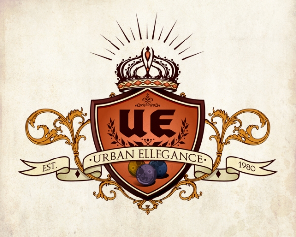
This was a long time in making but when Meedy Mek (CEO of Urban Ellegance) approached me… she was dead serious about her brand. She had an idea of doing a crest for the logo but didn’t know exactly which way to go. She researched some of the things she liked and sent them to me. We talked about not getting pigeon holed by using specific icons and after… she left it up to me.
I took a basic approach to it. Using the initials as the main image so that the viewer would need to know what it meant being so large. as far as any iconic imagery, I use the examples of the stones she uses to produce the jewelry. They have different meanings so that represents the variety of energies involved. At times elegance is extravagant,that is why you see a large banner in this piece. It’s huge but it flows ever so smoothly around the shield and floral. The Crown tops it off. Royal yet not so much of a stand out. Its about balance as a whole.
The final version was created after a bunch of rough versions. HAAA. All in all, the client was overly satisfied and the trial made the result that much more powerful.


